> ## Documentation Index
> Fetch the complete documentation index at: https://docs.flexprice.io/llms.txt
> Use this file to discover all available pages before exploring further.
# Portal Configuration
> Control which sections your customers see in the Customer Portal, and style it with your own brand
The Customer Portal is configured per tenant and environment. You choose which sections appear, which widgets sit inside them, and what colours, logo and font the portal renders with. The configuration is stored under the `customer_portal_config` setting key, and the portal fetches it on load.
Anything you leave unset falls back to a default, so a tenant that has never touched the configuration still gets a complete portal.
## Settings toggles
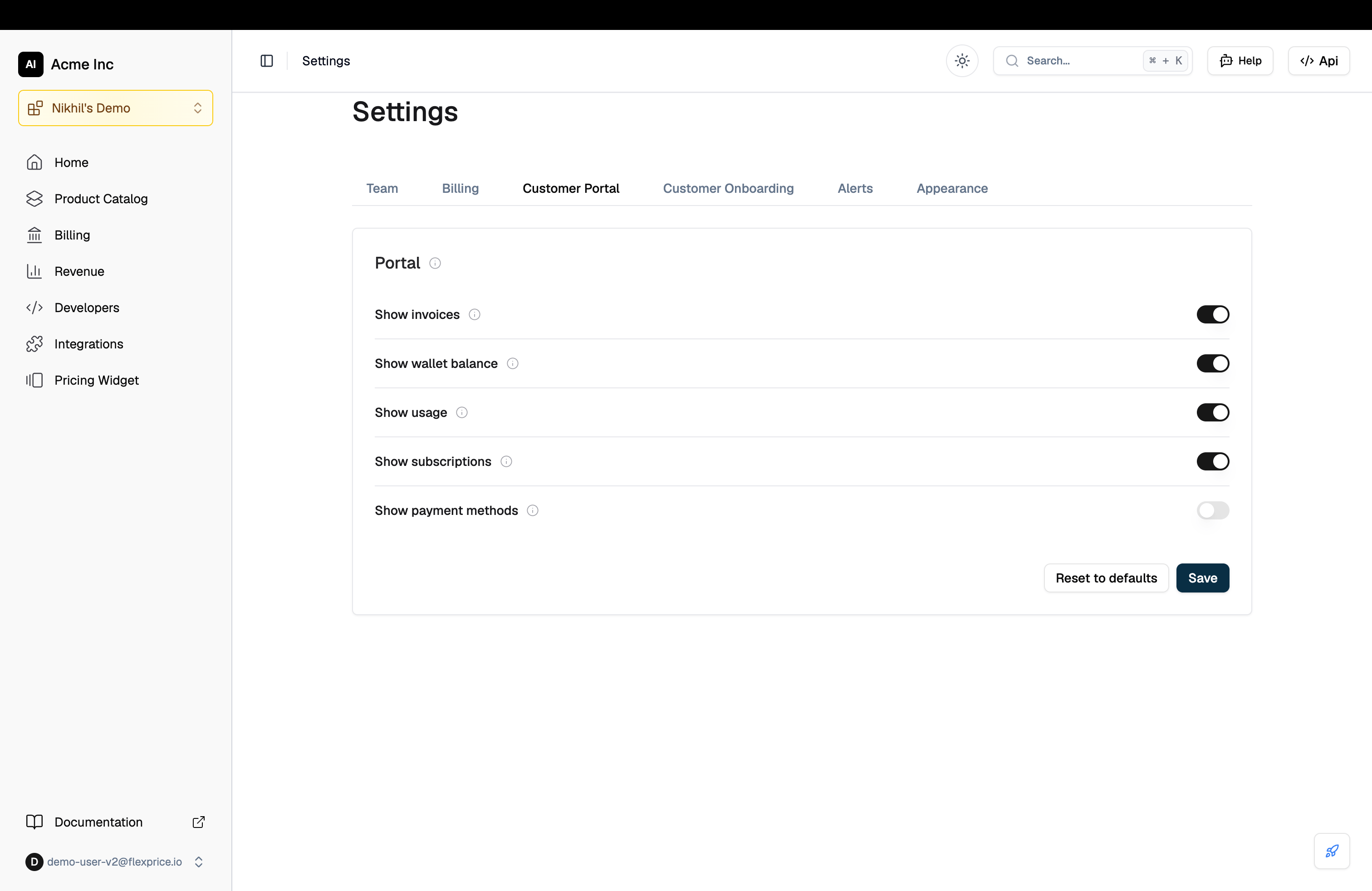
The dashboard exposes the five section-level switches most tenants need. Go to **Settings** and open the **Customer Portal** tab.
| Toggle | Controls |
| ------------------------ | ------------------------------------------------------------------ |
| **Show invoices** | The Invoices section, including PDF download and Pay now |
| **Show wallet balance** | The Credits section, including transaction history and auto top-up |
| **Show usage** | The Usage section, including charts, breakdown and metric cards |
| **Show subscriptions** | The subscriptions widget on Overview |
| **Show payment methods** | Saved card management |
Changes apply to every portal session opened in that environment from the next page load.
 **Saving the configuration requires Super Admin**
The portal configuration is stored through the settings API, whose writes are restricted to Super Admin regardless of the `portal:write` permission. A user without it sees the toggles but cannot save.
## Configuration schema
For anything beyond the five toggles, write the configuration directly through the settings API under the key `customer_portal_config`.
```json theme={null}
{
"version": "1.0",
"theme": {
"primary_color": "#15547c",
"background_color": "#ffffff",
"surface_color": "#f9fafb",
"border_color": "#e5e7eb",
"logo_url": "https://yourapp.com/logo.svg",
"font_family": "Inter, sans-serif"
},
"sections": [
{
"id": "overview",
"label": "Overview",
"enabled": true,
"order": 1,
"tabs": [
{ "id": "16", "type": "wallet_balance", "enabled": true, "order": 1 },
{ "id": "17", "type": "payment_methods", "enabled": true, "order": 2 },
{ "id": "9", "type": "subscriptions", "enabled": true, "order": 3 }
]
}
]
}
```
### Section fields
| Field | Type | Description |
| --------- | ------- | ----------------------------------------------------------------------------------- |
| `id` | string | Section identifier. The known ids are `overview`, `usage`, `credits` and `invoices` |
| `label` | string | Name shown in the portal's tab bar |
| `enabled` | boolean | Whether the section appears at all |
| `order` | number | Position in the tab bar. Standard sections use the product's own ordering |
| `tabs` | array | Widgets rendered inside the section, sorted by their `order` |
### Widget fields
| Field | Type | Description |
| -------------- | ------- | ------------------------------------------------------------- |
| `id` | string | Unique instance key within the section |
| `type` | string | Which widget to render. See the widget types below |
| `label` | string | Optional display label, overriding the widget's default title |
| `enabled` | boolean | Whether the widget renders |
| `order` | number | Position within the section |
| `usage_graph` | object | Only read when `type` is `usage_graph` |
| `metric_cards` | object | Only read when `type` is `metric_cards` |
## Widget types
| Type | Renders |
| --------------------- | --------------------------------------------------------------- |
| `account_summary` | Compact strip of balance, amount due and next billing date |
| `subscriptions` | Active subscriptions with plan, status, period and next billing |
| `invoices` | Invoice table with search, detail drawer, download and Pay now |
| `wallet_balance` | Wallet balance in credits and currency, with top-up actions |
| `wallet_transactions` | Full credit and debit history |
| `wallet_topup` | Standalone top-up card |
| `auto_topup` | Auto top-up summary and settings |
| `payment_methods` | Saved cards, with add, remove and set default |
| `usage_graph` | Usage trend chart with a date range selector |
| `usage_breakdown` | Per-feature table of usage, events and cost |
| `current_usage` | Consumption in the in-progress billing period |
| `metric_cards` | Revenue, custom analytics and optional cost metrics |
### Usage graph configuration
```json theme={null}
{
"id": "2",
"type": "usage_graph",
"enabled": true,
"order": 2,
"usage_graph": {
"date_presets": ["today", "last_7_days", "last_30_days", "current_month", "last_month"],
"default_preset": "last_7_days",
"allow_custom_date_range": true,
"feature_filter_mode": "all",
"feature_ids": []
}
}
```
| Field | Description |
| ------------------------- | ------------------------------------------------------------------ |
| `date_presets` | Which range presets the customer can pick from |
| `default_preset` | The range selected when the section opens |
| `allow_custom_date_range` | Whether a custom start and end date picker is offered |
| `feature_filter_mode` | `all`, `include_list` or `exclude_list` |
| `feature_ids` | Feature ids used when the mode is `include_list` or `exclude_list` |
Valid presets are `today`, `last_7_days`, `last_30_days`, `current_month` and `last_month`.
### Metric cards configuration
```json theme={null}
{
"id": "1",
"type": "metric_cards",
"enabled": true,
"order": 1,
"metric_cards": {
"show_custom_metrics": true,
"show_revenue_metric": true,
"show_cost_metrics": false
}
}
```
| Field | Default | Shows |
| --------------------- | ------- | ------------------------------------------------------ |
| `show_custom_metrics` | `true` | Cards defined in your revenue analytics custom metrics |
| `show_revenue_metric` | `true` | The customer's total spend |
| `show_cost_metrics` | `false` | Cost, Margin and Margin % |
**Cost metrics are your numbers, not the customer's**
`show_cost_metrics` exposes your cost to serve this customer and your margin on them. It is off by default. Turn it on only for a portal your own team uses.
## How your configuration merges with the defaults
Understanding the merge matters when a Flexprice release adds a section or changes one.
* **Your sections win on content.** Labels, `enabled` and the widgets inside a section are yours.
* **Standard sections take the product's ordering.** A stored configuration carries the `order` values current when you saved it, so a section later promoted in the defaults would otherwise stay where it was. Sections you add yourself keep their own order and are placed after the standard ones.
* **New default sections are appended, not dropped.** A wholesale replace would hide any section shipped after you saved, so a section you have never seen is added rather than lost. Express removal as `"enabled": false`, not by deleting the entry.
* **Overview's composition is fixed.** Overview is balance, payment methods and subscriptions. It is not customisable per tenant, because any analytics widget placed there also renders the section's date filter, which duplicated Usage.
* **A theme with no values is ignored.** An empty theme object does not override the default light appearance.
**The Payments section is retired**
Saved cards used to live in a section of their own. They now sit on Overview, beside the balance they top up and the subscriptions they pay for. A stored configuration naming a `payment_methods` section is honoured as hidden. Use the **Show payment methods** toggle to control the widget.
## Theming
Supply four brand colours and the portal derives the rest, including text colours, from the brightness of your background.
| Field | Applies to |
| ------------------ | -------------------------------- |
| `primary_color` | Buttons, active tabs and accents |
| `background_color` | The page background |
| `surface_color` | Card and panel backgrounds |
| `border_color` | Card and table borders |
| `logo_url` | The logo in the portal header |
| `font_family` | A CSS font stack for portal text |
Leave the whole `theme` object out to use the portal's default light appearance.
Give `font_family` a real fallback stack, for example `"Inter, system-ui, sans-serif"`. The portal does not load web fonts on your behalf.
## Reading the configuration from the portal
A portal session reads its own resolved configuration, already merged with the defaults:
```
GET /v1/customer/portal/config
X-Session-Token:
```
Use this if you build your own portal front end against the Flexprice APIs and want to honour the same tenant configuration.
## Related resources
Sessions, sections and the security model
Invoice payment, top-ups, auto top-up and saved cards
All tenant and environment setting keys
Embed the same widgets directly in your own product
**Saving the configuration requires Super Admin**
The portal configuration is stored through the settings API, whose writes are restricted to Super Admin regardless of the `portal:write` permission. A user without it sees the toggles but cannot save.
## Configuration schema
For anything beyond the five toggles, write the configuration directly through the settings API under the key `customer_portal_config`.
```json theme={null}
{
"version": "1.0",
"theme": {
"primary_color": "#15547c",
"background_color": "#ffffff",
"surface_color": "#f9fafb",
"border_color": "#e5e7eb",
"logo_url": "https://yourapp.com/logo.svg",
"font_family": "Inter, sans-serif"
},
"sections": [
{
"id": "overview",
"label": "Overview",
"enabled": true,
"order": 1,
"tabs": [
{ "id": "16", "type": "wallet_balance", "enabled": true, "order": 1 },
{ "id": "17", "type": "payment_methods", "enabled": true, "order": 2 },
{ "id": "9", "type": "subscriptions", "enabled": true, "order": 3 }
]
}
]
}
```
### Section fields
| Field | Type | Description |
| --------- | ------- | ----------------------------------------------------------------------------------- |
| `id` | string | Section identifier. The known ids are `overview`, `usage`, `credits` and `invoices` |
| `label` | string | Name shown in the portal's tab bar |
| `enabled` | boolean | Whether the section appears at all |
| `order` | number | Position in the tab bar. Standard sections use the product's own ordering |
| `tabs` | array | Widgets rendered inside the section, sorted by their `order` |
### Widget fields
| Field | Type | Description |
| -------------- | ------- | ------------------------------------------------------------- |
| `id` | string | Unique instance key within the section |
| `type` | string | Which widget to render. See the widget types below |
| `label` | string | Optional display label, overriding the widget's default title |
| `enabled` | boolean | Whether the widget renders |
| `order` | number | Position within the section |
| `usage_graph` | object | Only read when `type` is `usage_graph` |
| `metric_cards` | object | Only read when `type` is `metric_cards` |
## Widget types
| Type | Renders |
| --------------------- | --------------------------------------------------------------- |
| `account_summary` | Compact strip of balance, amount due and next billing date |
| `subscriptions` | Active subscriptions with plan, status, period and next billing |
| `invoices` | Invoice table with search, detail drawer, download and Pay now |
| `wallet_balance` | Wallet balance in credits and currency, with top-up actions |
| `wallet_transactions` | Full credit and debit history |
| `wallet_topup` | Standalone top-up card |
| `auto_topup` | Auto top-up summary and settings |
| `payment_methods` | Saved cards, with add, remove and set default |
| `usage_graph` | Usage trend chart with a date range selector |
| `usage_breakdown` | Per-feature table of usage, events and cost |
| `current_usage` | Consumption in the in-progress billing period |
| `metric_cards` | Revenue, custom analytics and optional cost metrics |
### Usage graph configuration
```json theme={null}
{
"id": "2",
"type": "usage_graph",
"enabled": true,
"order": 2,
"usage_graph": {
"date_presets": ["today", "last_7_days", "last_30_days", "current_month", "last_month"],
"default_preset": "last_7_days",
"allow_custom_date_range": true,
"feature_filter_mode": "all",
"feature_ids": []
}
}
```
| Field | Description |
| ------------------------- | ------------------------------------------------------------------ |
| `date_presets` | Which range presets the customer can pick from |
| `default_preset` | The range selected when the section opens |
| `allow_custom_date_range` | Whether a custom start and end date picker is offered |
| `feature_filter_mode` | `all`, `include_list` or `exclude_list` |
| `feature_ids` | Feature ids used when the mode is `include_list` or `exclude_list` |
Valid presets are `today`, `last_7_days`, `last_30_days`, `current_month` and `last_month`.
### Metric cards configuration
```json theme={null}
{
"id": "1",
"type": "metric_cards",
"enabled": true,
"order": 1,
"metric_cards": {
"show_custom_metrics": true,
"show_revenue_metric": true,
"show_cost_metrics": false
}
}
```
| Field | Default | Shows |
| --------------------- | ------- | ------------------------------------------------------ |
| `show_custom_metrics` | `true` | Cards defined in your revenue analytics custom metrics |
| `show_revenue_metric` | `true` | The customer's total spend |
| `show_cost_metrics` | `false` | Cost, Margin and Margin % |
**Cost metrics are your numbers, not the customer's**
`show_cost_metrics` exposes your cost to serve this customer and your margin on them. It is off by default. Turn it on only for a portal your own team uses.
## How your configuration merges with the defaults
Understanding the merge matters when a Flexprice release adds a section or changes one.
* **Your sections win on content.** Labels, `enabled` and the widgets inside a section are yours.
* **Standard sections take the product's ordering.** A stored configuration carries the `order` values current when you saved it, so a section later promoted in the defaults would otherwise stay where it was. Sections you add yourself keep their own order and are placed after the standard ones.
* **New default sections are appended, not dropped.** A wholesale replace would hide any section shipped after you saved, so a section you have never seen is added rather than lost. Express removal as `"enabled": false`, not by deleting the entry.
* **Overview's composition is fixed.** Overview is balance, payment methods and subscriptions. It is not customisable per tenant, because any analytics widget placed there also renders the section's date filter, which duplicated Usage.
* **A theme with no values is ignored.** An empty theme object does not override the default light appearance.
**The Payments section is retired**
Saved cards used to live in a section of their own. They now sit on Overview, beside the balance they top up and the subscriptions they pay for. A stored configuration naming a `payment_methods` section is honoured as hidden. Use the **Show payment methods** toggle to control the widget.
## Theming
Supply four brand colours and the portal derives the rest, including text colours, from the brightness of your background.
| Field | Applies to |
| ------------------ | -------------------------------- |
| `primary_color` | Buttons, active tabs and accents |
| `background_color` | The page background |
| `surface_color` | Card and panel backgrounds |
| `border_color` | Card and table borders |
| `logo_url` | The logo in the portal header |
| `font_family` | A CSS font stack for portal text |
Leave the whole `theme` object out to use the portal's default light appearance.
Give `font_family` a real fallback stack, for example `"Inter, system-ui, sans-serif"`. The portal does not load web fonts on your behalf.
## Reading the configuration from the portal
A portal session reads its own resolved configuration, already merged with the defaults:
```
GET /v1/customer/portal/config
X-Session-Token:
```
Use this if you build your own portal front end against the Flexprice APIs and want to honour the same tenant configuration.
## Related resources
Sessions, sections and the security model
Invoice payment, top-ups, auto top-up and saved cards
All tenant and environment setting keys
Embed the same widgets directly in your own product